How to Combine Colors in Clothes
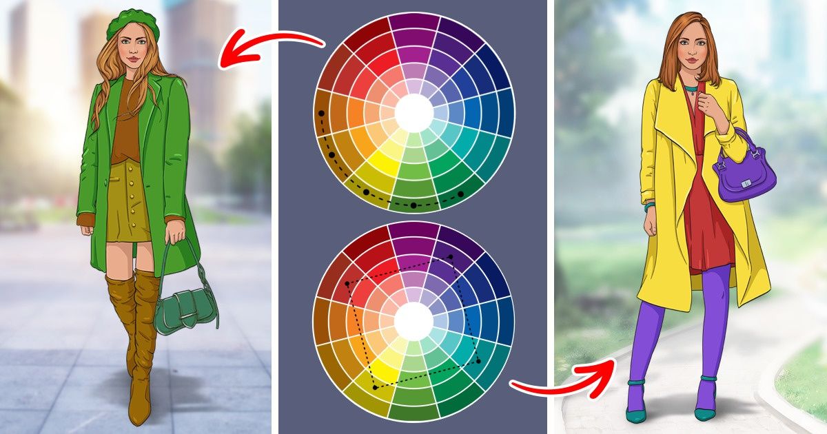
When choosing clothes, shoes, or accessories, you’ve probably noticed that some colors look great together, and others just don’t.
5-Minute Crafts is going to tell you how to make really good color combinations.
Color theory
The combination of colors in clothes is based on the theory of color. To make harmonious combinations, it’s important to understand which colors will complement each other and which won’t.
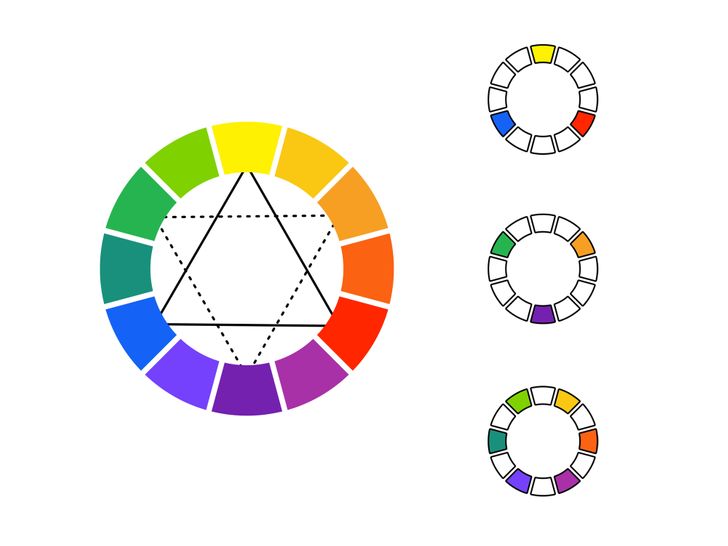
- There are only 3 primary colors that you can’t get just by mixing others: red, blue, and yellow. They are the start of all the other colors.
- If you mix any 2 of these primary 3 colors, you will have the secondary colors: orange, green, and purple.
- When mixing primary and secondary colors, you get tertiary colors.
- Primary, secondary, and tertiary colors make the color circle — the main tool you will need to make color combinations.
- Nearly every color has a temperature and saturation. A color can be warm or cold, bright or dark, or muted.
Important: black, gray, and white don’t have a temperature.
Scheme № 1: any color and its shades
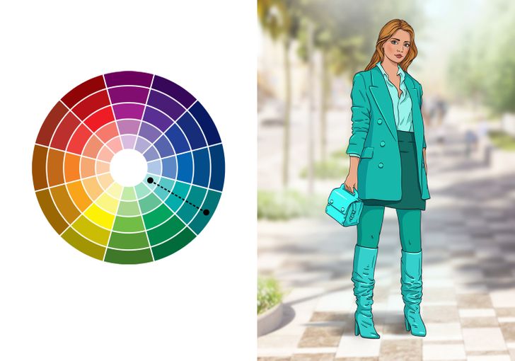
Any color looks good with the same color and its shades — this is the principle of a monochromatic scheme. Such a combination always looks calm and harmonious, but it might lack contrast.
To to do this with clothes, determine the main color and use more or less saturated shades of the same color.
If you are afraid of looking dull, try using different textures to make them look deeper.
Scheme № 2: complementary combinations
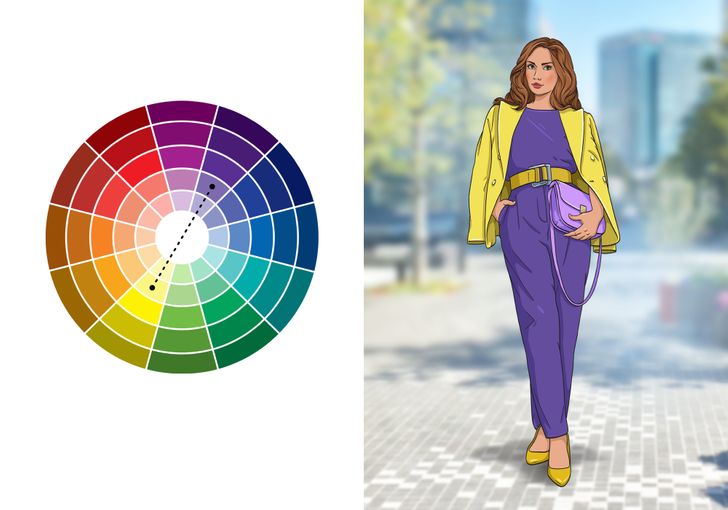
This color scheme is based on using 2 colors that are in front of each other on the circle. It enables maximum contrast, so it should be used carefully. The best way is to choose one color as the lead and the other one as an addition.
Try combining red and green, blue and orange, and yellow and purple to make your look very bright.
Scheme № 3: analogous
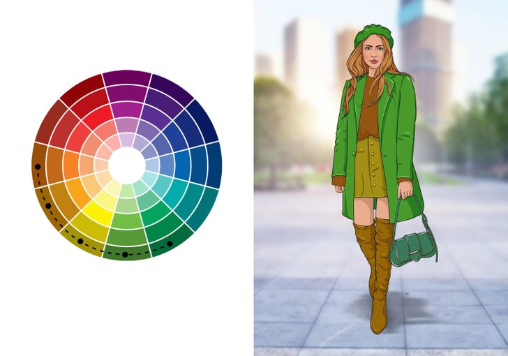
Scheme № 4: triadic
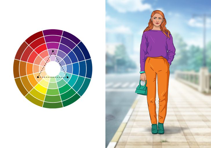
A triad is 3 colors on the color circle that are an equal distance from each other. You can make a triangle to connect them. Such a combination always looks bright and has high contrast.
If you decided to create a triad, choose a dominating color and choose the other 2 for highlights.
Scheme № 5: split complementary
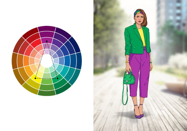
This scheme, like the previous 2, is based on the contrast principle. Choose 1 main color and 2 others for contrast.
It will be less aggressive than a combination of opposite colors.
Scheme № 6: square
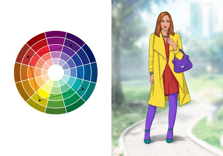
In the square color scheme, 4 colors that are equally distanced from each other are used. Such a combination has high contrast and brightness no matter how saturated the colors are.
Scheme № 7: rectangle
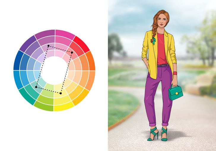
This scheme is a variation of the previous one but a bit more subtle. Usually, there are 2 dominating colors and the other 2 are there to highlight the contrast.
Scheme № 8: any color + achromatic colors
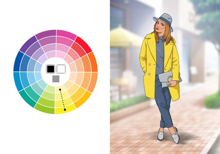
Black, white, and gray are achromatic colors. They don’t contain any color pigment, they don’t have a temperature, and they look great with each other and with other colors. Choose 1 color or its shade and add black or white clothes.
Dark blue and dark brown also look quite neutral, so they are easily combined with other colors.