How to Choose a Color for Your Business
Colors are a way to connect your business with your clients and the most powerful tool to do this is by using emotions. This is why it’s important to make a strong emotional connection with your audience and colors are the quickest way to your clientele’s hearts. We at 5-Minute Crafts have a whole scheme for how to choose the best color for your brand, and when you do, never forget to listen to your gut feeling.
1. Decide on your brand’s personality trait.
Before deciding what colors you want to represent your business, you should decide on your brand personality. The easiest way to do this is to see your company as a person and ask questions like:
❓Who are they?
❓What’s important to them?
Once you see your company’s personality goals you’ll be able to associate each color with the right emotions.
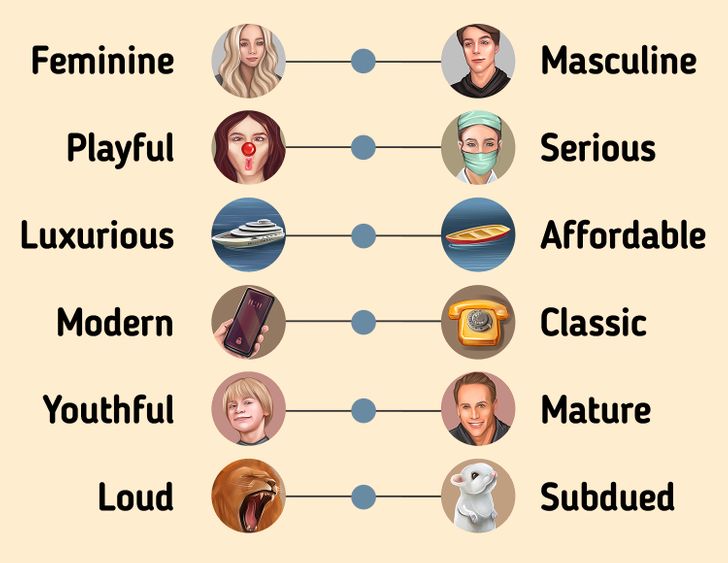
The spectrum of the company’s personality traits:
- Feminine ➡️ Masculine
- Playful ➡️ Serious
- Luxurious ➡️ Affordable
- Modern ➡️ Classic
- Youthful ➡️ Mature
- Loud ➡️ Subdued
2. The meaning of colors in business
The effect of your brand colors would also depend on the design in the style that you’ll use them in and also the color combination you will decide on. However, if you want, you can also choose just one color for your brand and most of your work will be over.
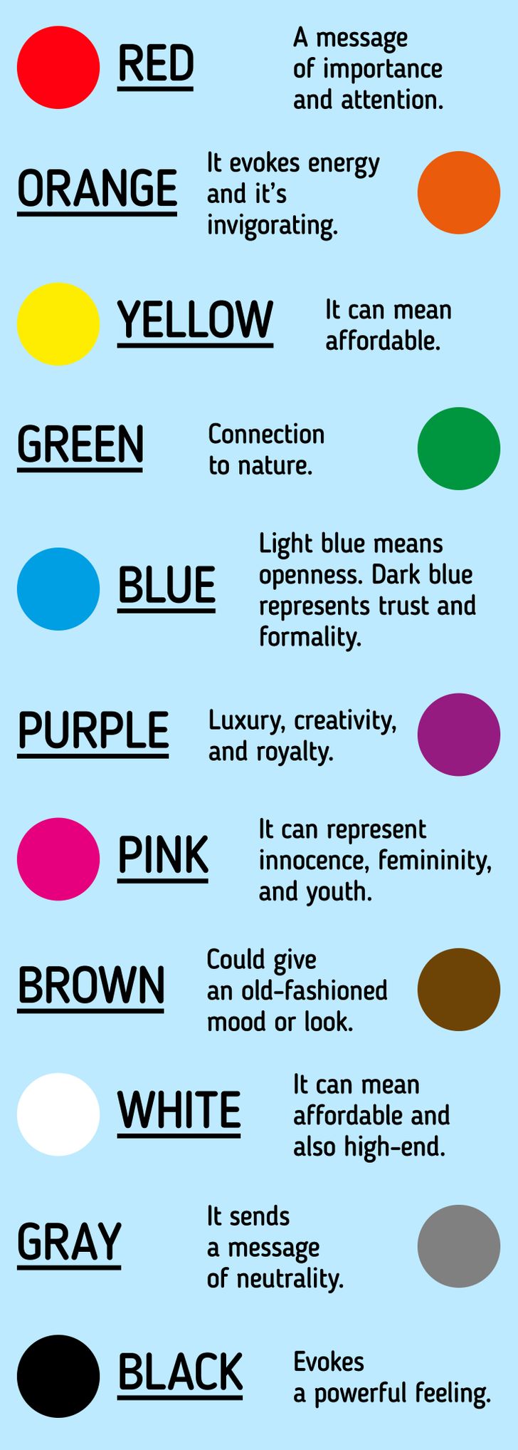
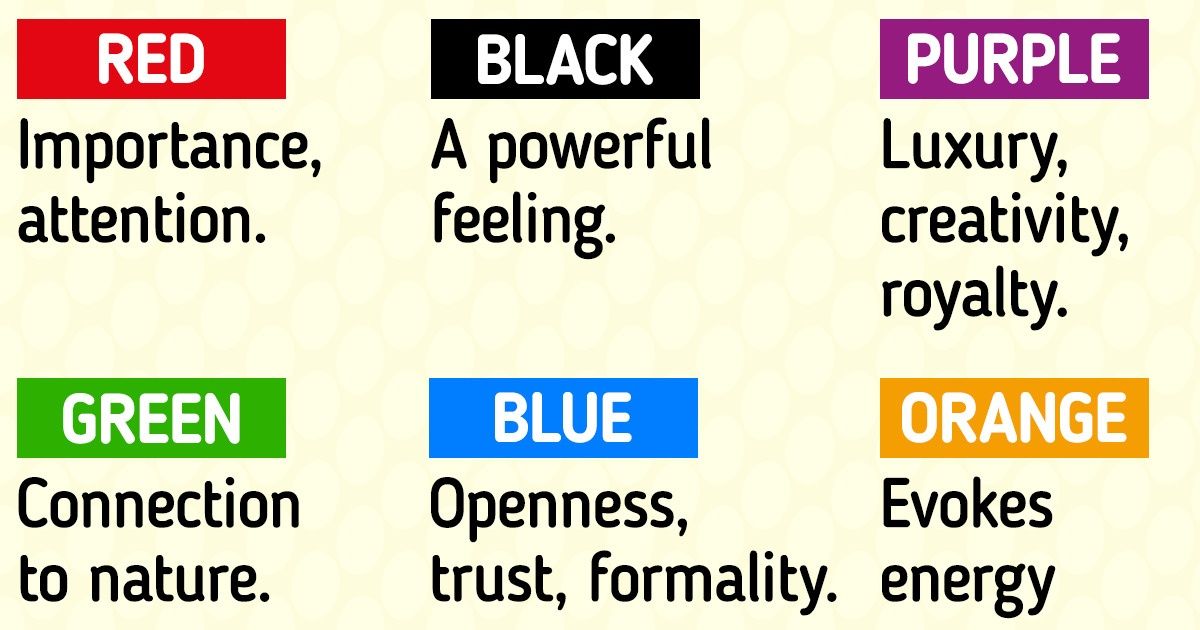
🟥Red — Anger, excitement, and passion. It could share a message of importance and attention.
🟧Orange — Friendliness, vitality, and playfulness. It evokes energy and it’s invigorating.
🟨Yellow — Optimism, youth, and happiness. However, it can also mean affordable, or attention.
🟩Green — Connection to nature, growth, prosperity, and stability.
🟦Blue — Light blue means openness, trust, and tranquility, and can mean innocence. Dark blue represents formality, security, and professionalism. It’s trustworthy and mature.
🟪Purple — Luxury, creativity, and royalty.
🌸Pink — Innocence, youth, femininity, and it ranges from luxurious to modern.
🟫Brown — earthy, rugged, and an old-fashioned mood or look.
🐼White — Simplicity, health, virtue, cleanliness, and it can represent affordable and also high end.
⬜️Gray — It shares a message of neutrality. Mature, mysterious, serious, classic, and subdued.
⬛️Black — Modern, luxurious, edgy, sophisticated, and a powerful feeling.
3. Using the brand color formula.
When we are dealing with brand identity it’s not wise to set fast and hard rules. Without a guide, the formula for building your brand color scheme could be confusing and daunting. So let’s see how to implement the formula step-by-step.
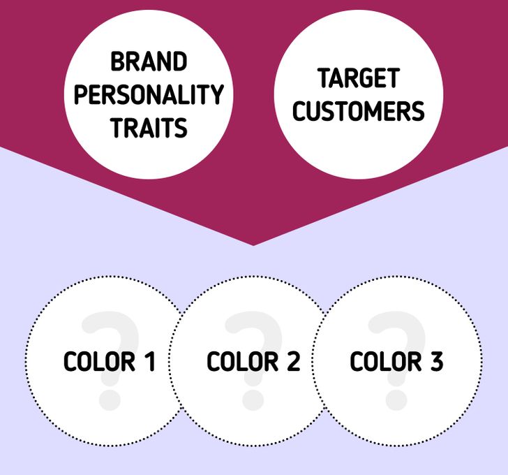
- Choose 3 colors — The base, the accent, and the neutral. Your brand can have 1-4 colors, and this depends on the monochrome scheme requiring different hues for various purposes.
- The base color — This should reflect your company’s personality, dominant trait, and also your target audience. You’ll choose the rest of the colors according to the base.
- The accent color — This will be the second most used color in your brand. It could be a bit trickier to choose because it will not only reflect the brand’s personality but it must also pair with the base color and match your audiences’ demands.
- The neutral color — This color will probably be the background color, something that will not draw attention. Usually, these colors are different hues of off whites, whites, beige, and gray. Black could also be an option, but use it with caution because it could dominate any base color.
4. Using the color schemes.
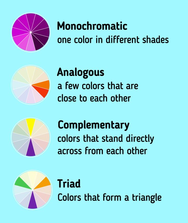
- Monochromatic — When your brand is focused on just one personality trait then it’s better to choose colors from the monochrome scheme because this will emphasize the meaning of the brand color you have chosen. This could be great for minimalist brands, the one challenge here is to choose the hues in a way that you don’t visually stun your audience.
- Analogous — These are colors that are next to each other on the color wheel and that have a really harmonious relationship. This is because the adjacent colors are similar in emotional connotations. While you can’t make a mistake with these colors, they are not the best if you want to draw attention or to stand out.
- Complementary — These are opposite colors on the color wheel — they sit directly across from each other. Due to this, when paired, they highlight the best in each other. These are best for stimulating and dynamic visuals. Because they are so popular, be careful with these colors because there is a big chance of copycatting another company.
- Triadic — This is one of the more stable color schemes. This is because they draw an equal part of the 3 different sections on the color wheel. They are best for analogous themes, yet offer stimulating variety. The most difficult part is to get all 3 colors to match the traits of your business identity.
What color is your brand? What colors do you see as the best choice for your future business?